


Illustration Identity for D91 Labs
Defining D91 Labs illustration identity
Defining D91 Labs illustration identity
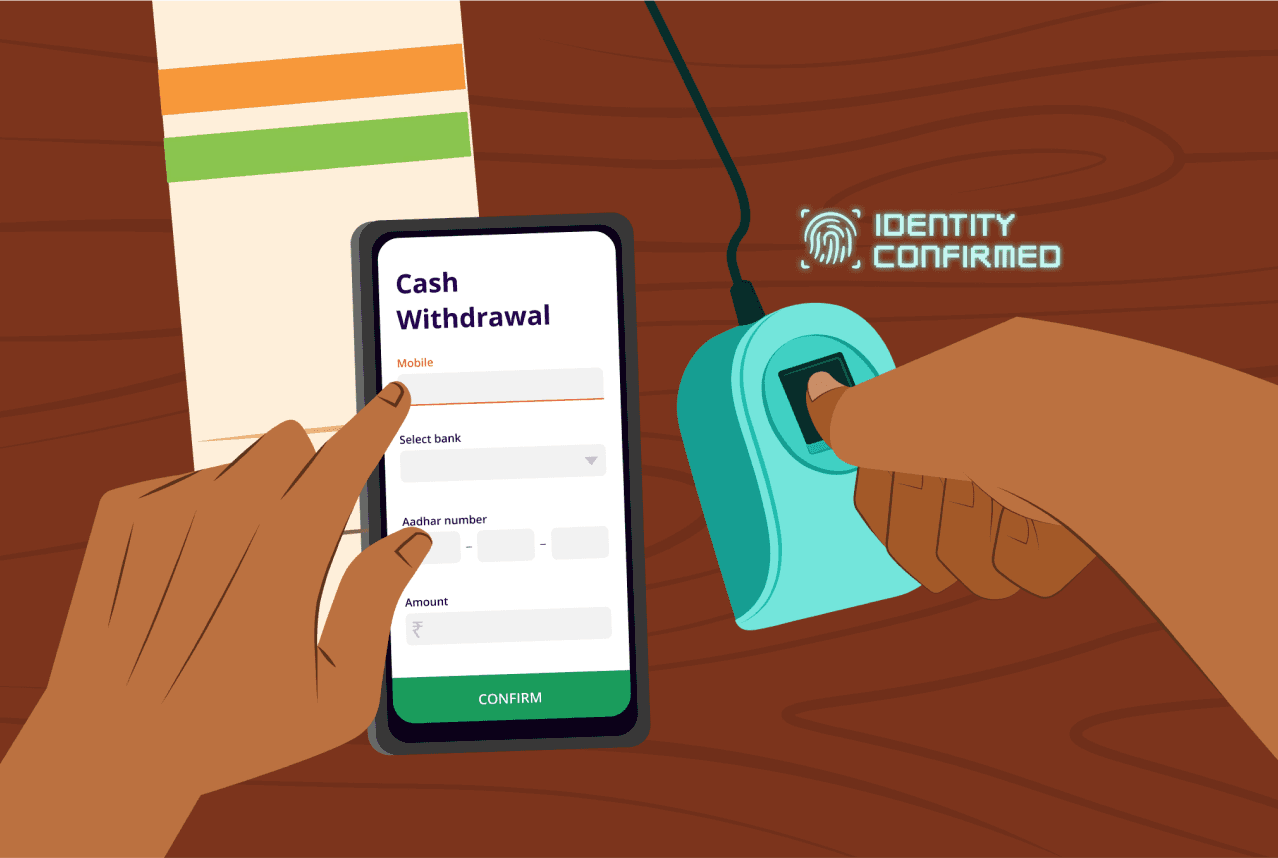
D91 Labs is Setu’s research arm, that conducts secondary and primary research into Indian fintech, and publishes findings as blog posts and other forms of media. Their vision is for research to help entrepreneurs create better solutions by informing fintech decision making.
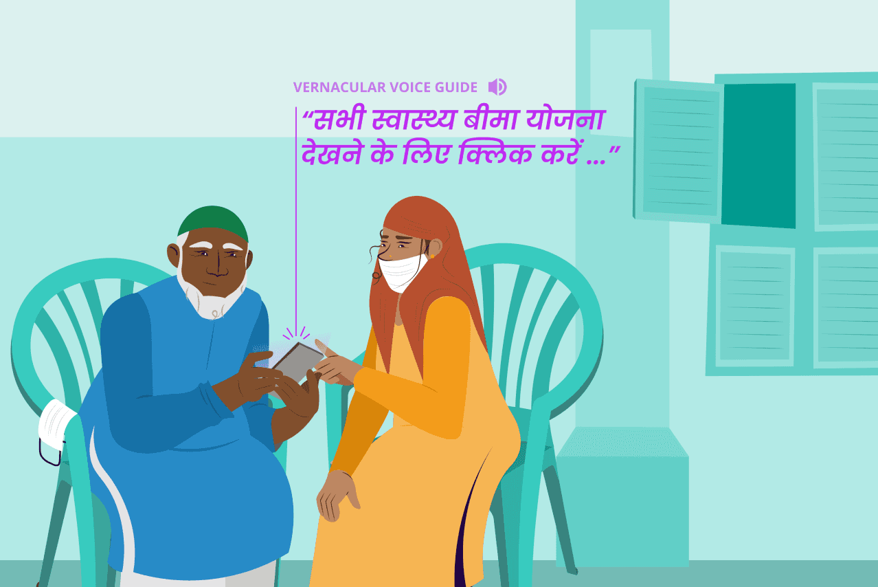
The goal of this project was to create D91 Labs' visual language, particularly their illustration language. As most of D91's research focuses on last mile users, human characters were crucial to the narrative and I dedicated great attention to developing a style for them. In addition, I concentrated on details such as characters' body language, attire, and the contexts or environments around them.
I wanted each illustration to evoke a sense of familiarity in readers, which would help them better connect with our blog posts. I wanted people to see them and think, "I've been here, or I've seen this kind of person somewhere."
D91 Labs is Setu’s research arm that conducts secondary and primary research into Indian fintech and publishes findings as blog posts and other forms of media. Their vision is for research to help entrepreneurs create better solutions by informing fintech decision making.
The goal of this project was to create D91 Labs' visual language, particularly their illustration language. As most of D91's research focuses on last mile users, human characters were crucial to the narrative. I dedicated great attention to developing a style for them. In addition, I also concentrated on details such as characters' body language, attire, and the contexts or environments around them.
I wanted each illustration to evoke a sense of familiarity in readers, which would help them better connect with our blog posts. I wanted people to see them and think, "I've been here, or I've seen this kind of person somewhere."
Designing the website
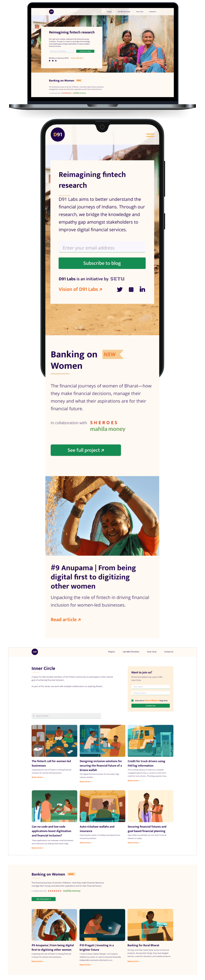
I designed D91’s website, the main purpose of which was to help readers find all of D91’s work in one place, as it was scattered across multiple blogging platforms and Youtube.
One of the main challenges was figuring out a logical way to group and label all the blog posts and other media, before moving on to the design. This needed multiple working sessions with the D91 team.
As part of this project, I also reworked D91’s logo to be multilingual.
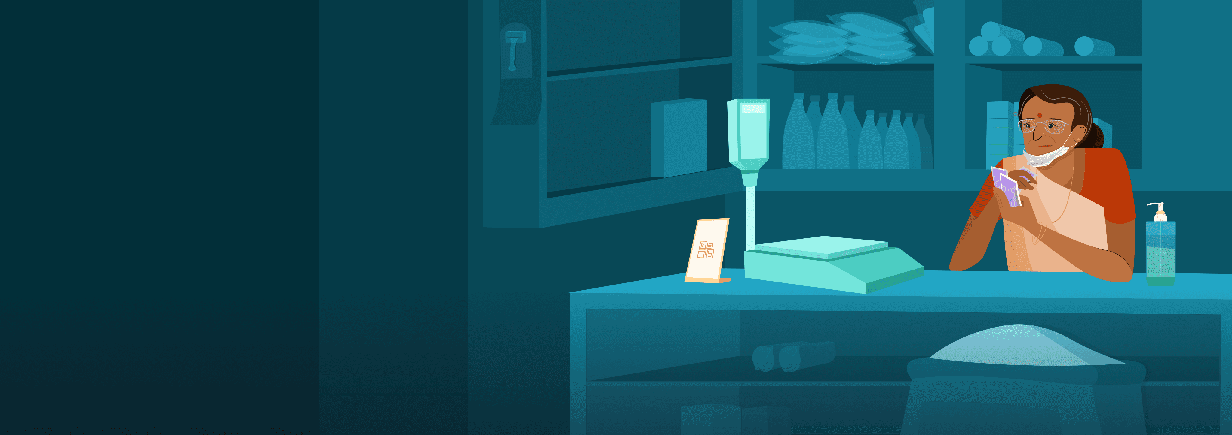
There was consensus on using a mix of illustrations and photographs on the website, and the image for the first fold was shot during a visit to Kunigal in rural Karnataka.
I designed D91’s website, the main purpose of which was to help readers find all of D91’s work in one place as it was scattered across multiple blogging platforms and Youtube.
One of the main challenges was figuring out a logical way to group and label all the blog posts and other media before moving on to the design. This needed multiple working sessions with the D91 team as there were close to a hundred articles that needed sorting.
As part of this project, I also reworked D91’s logo to be multilingual.
There was consensus on using a mix of illustrations and photographs on the website, and the image for the first fold was shot during a visit to Kunigal in rural Karnataka.

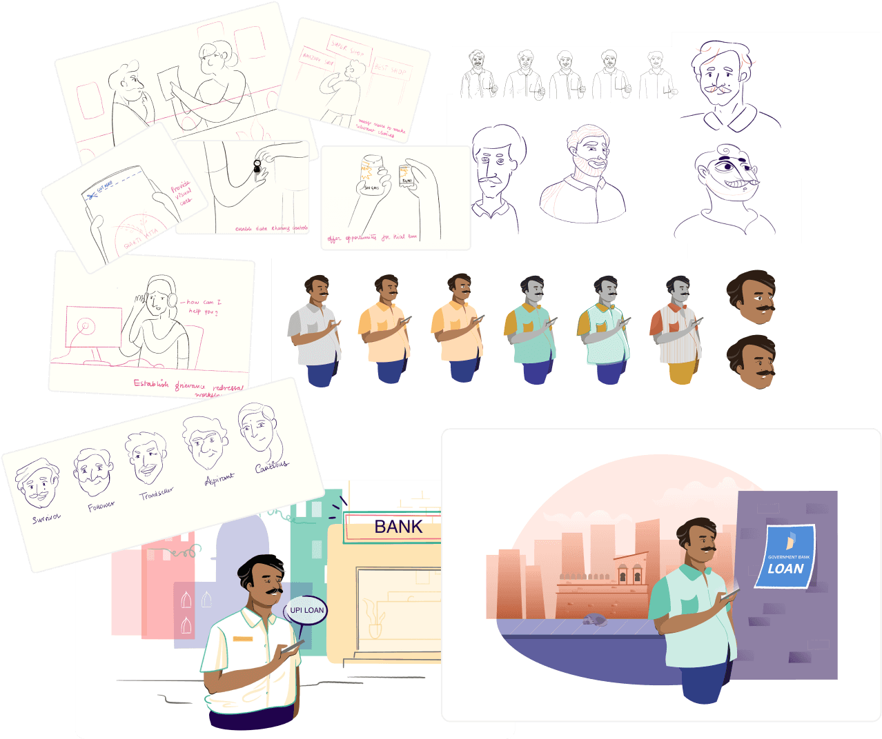
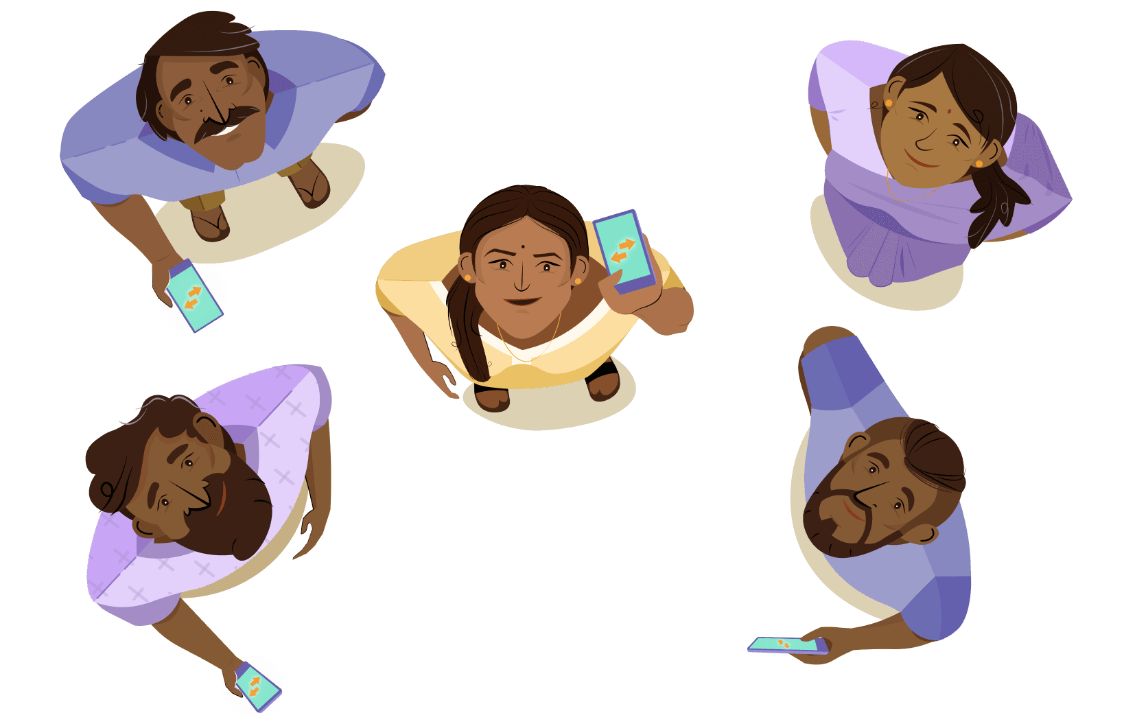
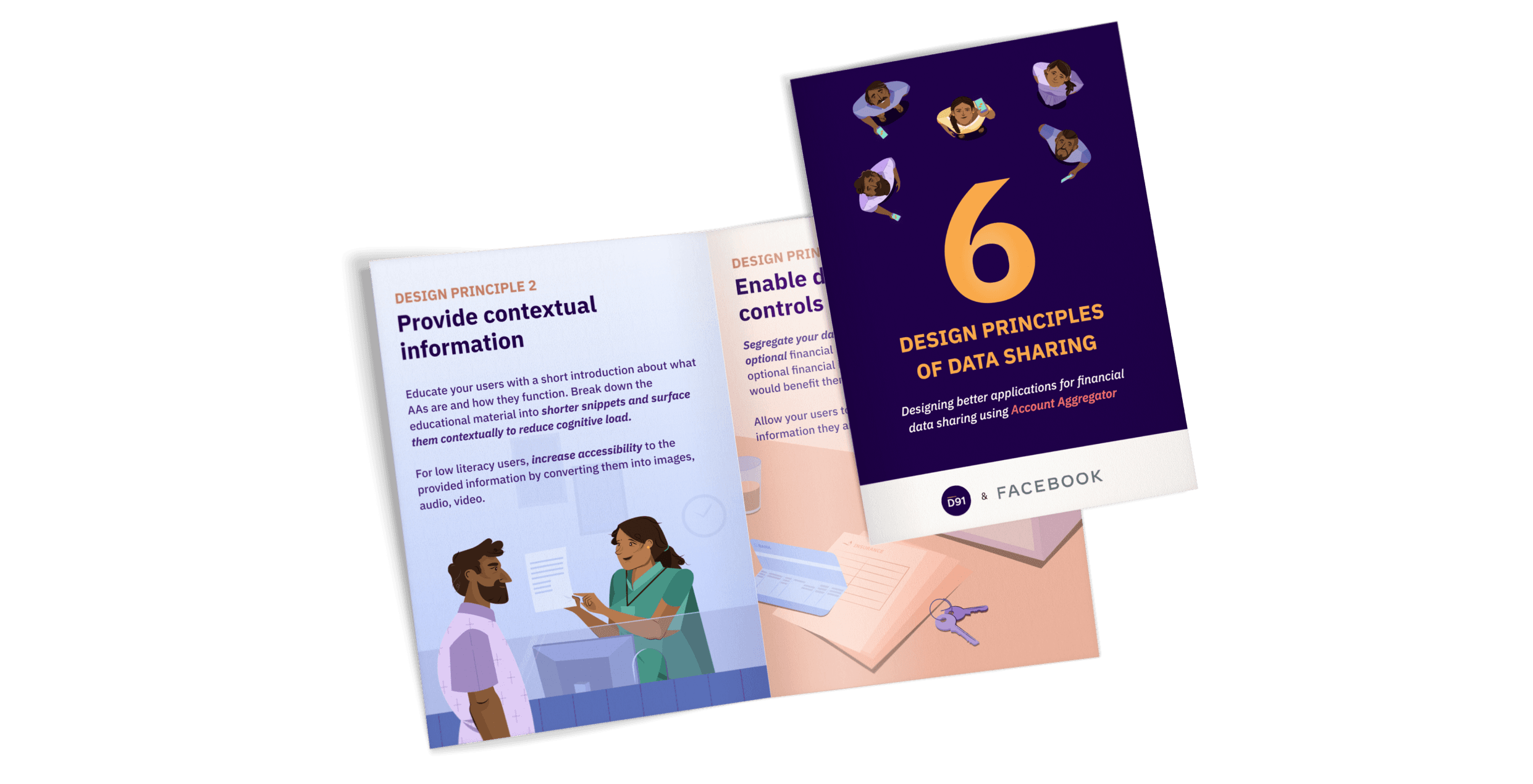
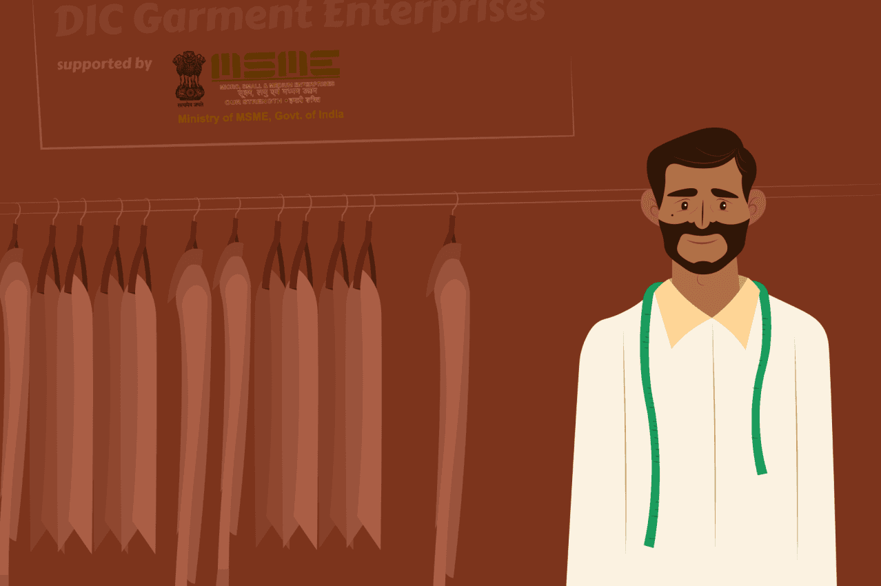
I designed the first set of illustrations for a project called Future of Data Sharing, which was a research foray into defining design ethics for potential digital product solutions that might be built on top of the Account Aggregator tech stack.
After working on some early explorations and a few rounds of discussion, we settled on a style that we felt looked attractive and captured the stories we wanted to tell. These illustrations were used across blog posts, a digital report, pitch decks, and a website.
I designed the first set of illustrations for a project called Future of Data Sharing which was a research foray into defining design ethics principles for potential digital product solutions that would built on top of the Account Aggregator tech stack.
After working on some early explorations and a few rounds of discussion, we settled on a style that we felt looked attractive and captured the stories we wanted to tell. These illustrations were used across blog posts, a digital report, pitch decks, and a website.


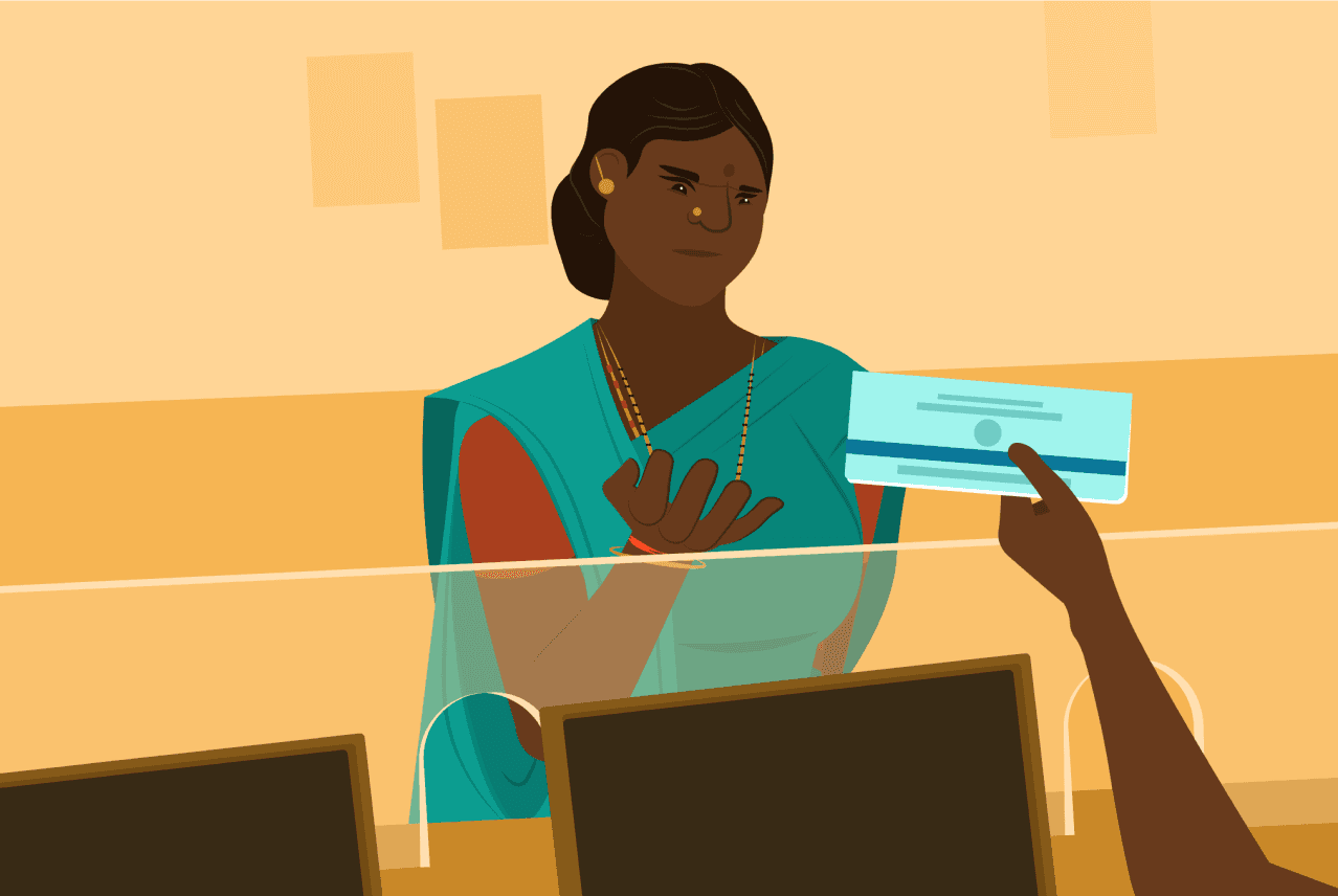
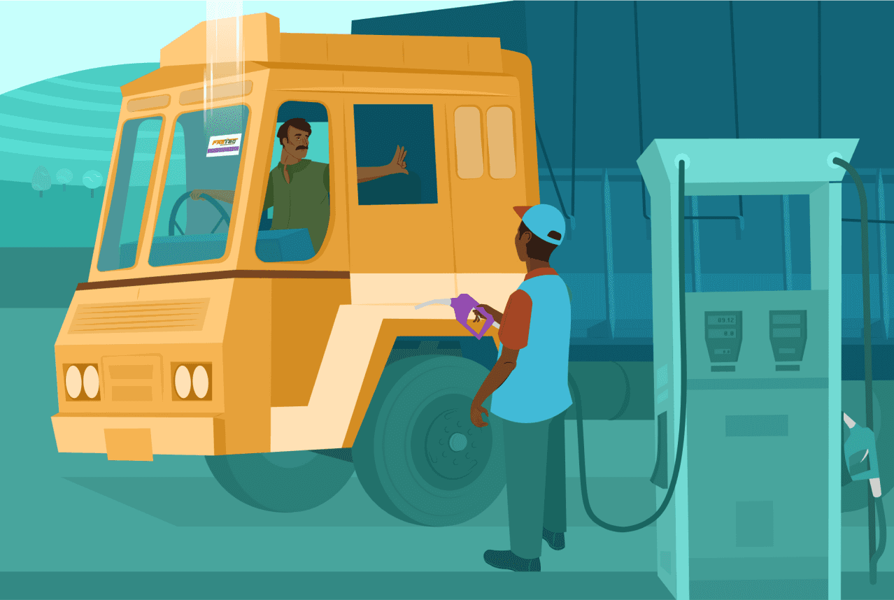
We continued to use this style for a while and further refine it.
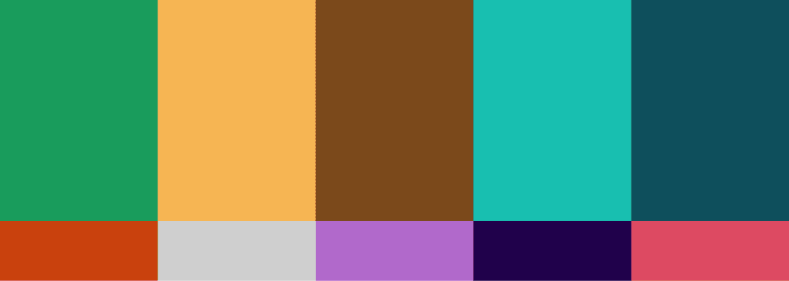
Over time, I noticed that our colour palette was a bit dull and lacked enough colours to do justice to more complex illustrations, and there was consensus on this.
I worked with the design team to figure out how to expand our palette and we finalised on using a family of bold colours inspired by India’s diversity and tropical climate.
Over time, I noticed that our colour palette was a bit dull and lacked enough colours to do justice to more complex illustrations and there was consensus on this.
I worked with the design team to figure out how to expand our palette and we finalised on using a family of bold colours inspired by India’s diversity and tropical climate.


These are a few of the many icons that were designed to help define section breaks in blog posts, for use in infographics, reports etc.
These are a few of the many icons that were designed to help define section breaks in blog posts, for use in infographics, reports etc.
These are a few of the many icons that were designed to help define section breaks in blog posts, for use in infographics, reports etc.

Updated in Dec 2024
Updated in Dec 2024
Defining D91 Labs illustration identity
D91 Labs is Setu’s research arm that conducts secondary and primary research into Indian fintech and publishes findings as blog posts and other forms of media. Their vision is for research to help entrepreneurs create better solutions by informing fintech decision making.
The goal of this project was to create D91 Labs' visual language, particularly their illustration language. As most of D91's research focuses on last mile users, human characters were crucial to the narrative. I dedicated great attention to developing a style for them. In addition, I also concentrated on details such as characters' body language, attire, and the contexts or environments around them.
I wanted each illustration to evoke a sense of familiarity in readers, which would help them better connect with our blog posts. I wanted people to see them and think, "I've been here, or I've seen this kind of person somewhere."
I designed the first set of illustrations for a project called Future of Data Sharing which was a research foray into defining design ethics principles for potential digital product solutions that would built on top of the Account Aggregator tech stack.
After working on some early explorations and a few rounds of discussion, we settled on a style that we felt looked attractive and captured the stories we wanted to tell. These illustrations were used across blog posts, a digital report, pitch decks, and a website.
We continued to use this style for a while and further refine it.

We continued to use this style for a while and further refine it.
Over time, I noticed that our colour palette was a bit dull and lacked enough colours to do justice to more complex illustrations and there was consensus on this.
I worked with the design team to figure out how to expand our palette and we finalised on using a family of bold colours inspired by India’s diversity and tropical climate.
These are a few of the many icons that were designed to help define section breaks in blog posts, for use in infographics, reports etc.
These are a few of the many icons that were designed to help define section breaks in blog posts, for use in infographics, reports etc.
Designing the website
I designed D91’s website, the main purpose of which was to help readers find all of D91’s work in one place as it was scattered across multiple blogging platforms and Youtube.
One of the main challenges was figuring out a logical way to group and label all the blog posts and other media before moving on to the design. This needed multiple working sessions with the D91 team as there were close to a hundred articles that needed sorting.
As part of this project, I also reworked D91’s logo to be multilingual.
There was consensus on using a mix of illustrations and photographs on the website, and the image for the first fold was shot during a visit to Kunigal in rural Karnataka.

Updated in Dec 2024
Updated in Dec 2024